Worse Witcher 3 Remastered footage side-by-side
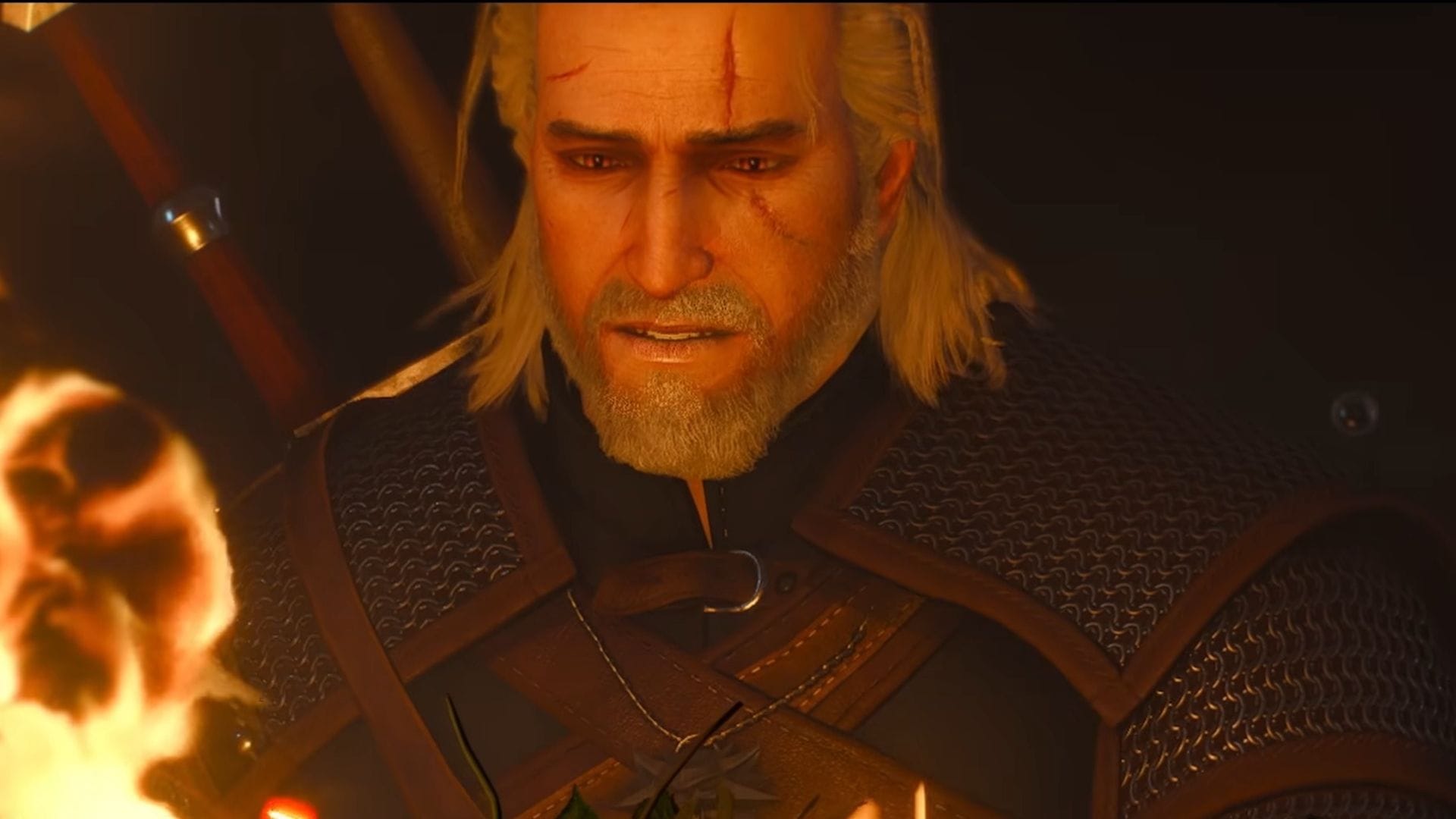
The anticipation for The Witcher 3 Remastered has been palpable, and as players gear up for the release, developers are sharing new footage that demands a closer look at the visual decisions made. But as with any major update, some observers are raising a critical question: in the pursuit of polish, have the details and the atmosphere of the original world been lost in translation?
To gauge the impact of these changes, CD Projekt Red provided a side-by-side comparison showing Geralt performing a fiery action in a swamp—specifically, torching a group of Drowners—both in the original game and in the upcoming remaster. This clip quickly sparked a lively debate among the community, pitting nostalgia against newfound graphical fidelity.
While the remaster undoubtedly boasts impressive graphical updates, some analysis of the comparison suggests a clash of aesthetic sensibilities. One notable point of contention is the rendering of the characters themselves. The skin and muscle of the Drowners in the new version appear less detailed, despite the potential for higher graphical effects. This effect seems driven by a bizarrely glossy, metallic shine, leading some to wonder if the focus shifted too far onto texture over substance.
The handling of dynamic elements, such as the fire, offers another point of friction. Although the fire effect in the new version is undeniably visible, it lacks the visceral power of the original. Instead of feeling like an actual inferno, it often appears more like a mere torch. Furthermore, the reflection of this fire in the water seems to be missing the fiery, scarlet reflections that defined the original game’s gorgeous water effects.
This visual disparity extends beyond the immediate action. The overall atmosphere seems to have shifted from the rich, dusky, and slightly foggy mood of the original game to something that feels almost sterile. The remaster’s lighting, while clear and bright, seems to wash out the distinctive warm redness and deep shadows that contributed to the world’s cohesive and weighty atmosphere.
This contrast begs a deeper conversation about the balance between modernization and preservation. While individual components might look sharper up close in the remaster, pulling back to view the entire canvas reveals that the original game maintains a superior sense of cohesion and saturation. It suggests that the subtle artistic choices—like the atmospheric fog and rich color palette—were integral to the narrative experience.
This observation resonates across the community. Questions about the removal of specific elements, like the original colors and the ambient fog, are being actively debated, with fans suggesting that while clarity is welcome, the unique mood of the original must be preserved. As the wait for the remaster continues, it is clear that the journey into the new world will also be a journey through the visual history of the game.
Buy on Amazon
Credit