Zelda Ocarina of Time Artwork Splits Fans After Trailer Reveal
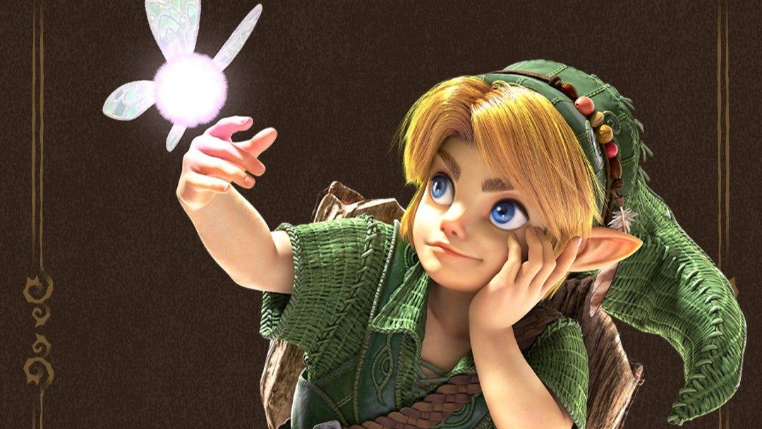
The world of gaming is buzzing with anticipation, not just for a remake, but for a visual revolution. Nintendo has unveiled a new art style for the remake of The Legend of Zelda: Ocarina of Time, sparking a lively, sometimes heated, debate among long-time fans.
The new visuals represent a significant departure from the classic N64 aesthetic, yet they are carefully calibrated. Nintendo’s goal seems to be to create a bridge: marrying the technical capabilities of modern hardware like the Switch 2 with the beloved, slightly exaggerated and angular style of the original game. They consciously avoided adopting trends like cel-shading, which is popular in other titles like Breath of the Wild, or the grittier tones found in Twilight Princess.
This artistic decision immediately drew a spectrum of reactions online. While some embraced the fresh look, others felt the shift was too radical. Some took immediate offense, noting that the new character designs looked wildly different from the iconic heroes they grew up with.
The criticisms were sharp. Some fans joked that the characters looked bizarre, with comments ranging from jokingly suggesting Kid Link looks like a goldfish to lamenting how the designs looked “too busy” compared to the original.
Particular focus of the critique landed on the redesigned Young Link and Young Zelda. While some appreciated the added detail, others felt that these new versions, with their larger foreheads and increased detail, felt less familiar. One observer noted that while the new art was a shock initially, watching the reveal ultimately led to appreciation for the new direction.
Other creative concerns surfaced regarding character design elements. Some felt the rendering of Child Link appeared overly “wet and greebled,” and there were strong opinions about the voice acting and cutscenes. However, amidst the visual critiques, certain elements received universal acclaim.
The redesigns of the antagonists and key figures seemed to resonate strongly with the community. Critics widely praised the new look of Sheik and Ganondorf, with many calling the updated designs powerful and impressive. One fan declared that the Sheik redesign alone justified the entire remake, noting that the villains “understood the assignment.”
Even the protagonist received some positive attention. Some fans felt the character details, such as beads on Link’s cap, added a charming new layer, describing the updated characters as “adorable.”
Beyond the art, the news surrounding the remake also included details about the future, including the release date, pricing structure, and the introduction of new features like a companion app. Furthermore, the reveal of new Young Link and Young Zelda amiibo figurines added another layer of collectible excitement to the anticipation.
Ultimately, the visual overhaul of Ocarina of Time is more than just a change in graphics; it’s a conversation about nostalgia, innovation, and the evolving identity of a classic. Whether you love the new take or prefer the original, the community is clearly engaged, eager to see how this new vision shapes the future of the Zelda franchise.
Buy on Amazon
Credit